


The Island of Vancouver Island is located in the Pacific North West on the West Coast of Canada. Toted as an Island boasting an abundance of natural beauty, millions of tourists flock to the island every year from Canada and abroad. Vancouver Island Has a population of over 700, 000 spread across 40 municipalities, and also boasts The Provincial capital of British Columbia, Victoria. Communities and regions have their own identity and ‘brand.’ The ‘brand’ itself is often displayed by using a logo that can give visual and non-verbal cues about the identity of a region. Based on the ‘raw data’ of municipal logos, who are Vancouver Island municipalities saying they are?
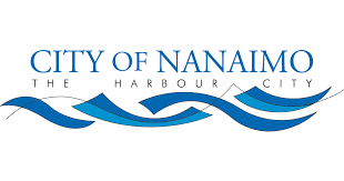
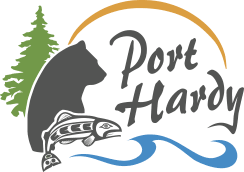
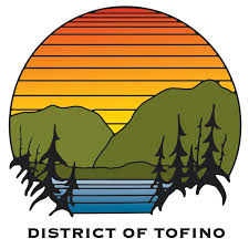
Vancouver Island is toted as an Island full of natural beauty or a place for nature lovers to explore, so it’s no surprise that all but two of the municipal logos contain the colours blue or green. The two colours are often known to represent water, air, trees, or earth. Another thing of note is that the majority of municipal logos either contain images/graphics of nature or animals. Overall, I would say that the 40 municipal logos of Vancouver Island are attempting to re-affirm the notion that Vancouver Island is a place of natural beauty and a nature lovers paradise. Socially and culturally, much of Vancouver Island is tied to nature, which I believe is reflected in the logos. The logos also indicate that each municipality is aiming to draw tourists to their location, highlighting how tourism is one of the primary industries of Vancouver Island. Whether to draw in tourists or new residents, it’s is clear that the natural landscape of each municipality is represented in each logo.


Taking a closer look at the municipal flags for Mid-Island Municipalities, we see that all but one municipality uses blue or green in their logos. The exception being the town of Ladysmith, which is known for its historic downtown—looking at Ladysmith’s logo, which is black in white in stark comparison to the other mid-island municipalities logo’s. We can see how their logo is designed to highlight their downtown area, a branding move that pushes attention to the town’s central feature, which unlike the other cities, is not its natural beauty, but it’s the historic downtown area. The city of Parksville’s logo, on the other hand, features a blue sand dollar, which highlights one of its main features it’s beachfront. Parksville is known for Parksville beach, which hosts numerous events such as the Parksville sandcastle sculpture competition, which draws thousands of tourists every year. The municipality of Parksville’s logo is branding its city as a beachfront city that tourists and locals alike can enjoy. Overall, all five logos brand their districts by highlighting their cities’ main attractions and four of the logos use colours and images associated with the nature of Vancouver to highlight their region’s natural attractions.
I think what’s lacking from many of the municipal logos is a sense of duality. I think many of the logos only showcase one side of a cities brand and fail to highlight any other features of said city. While Vancouver Island is known for its nature, I think using that as a single branding point takes away from much of what the municipalities have to offer. Ladysmith’s logo, unlike most of the others, doesn’t follow the themes of nature but focuses on its historic downtown. If I were to change the Ladysmith logo, I think the one thing its missing is the incorporation of some of its natural landmarks. Ladysmith sits on a hill of sorts, so it overlooks a beautiful piece of ocean. I think by adding both aspects, nature and its historic downtown, the Municipality would expand on its brand and showcase more of what that Municipality represents.
